
Washington Wild Web Redesign
a new identity and experience of Washington Wild website,
which will increase community engagement for long-term sustainable goals
Project Type
Graduate School Project
Team
Feifei Deng, Chris, Joanna, Sung-ju, Stephen
My role
Design System Lead, UX/UI Designer, UX Researcher
Duration
Apr 2020 - June 2020
overview
background
who is Washington Wild
Our client is the Washington Wild, a member-based nonprofit organization. They are the only statewide group dedicated to protecting three acres of wild lands and waters in Washington state since 1979.
why redesign
01.
Usability problems caused high drop-off rates
02.
Not able to differentiate from similar organization
Washington Wild is recently planning for improvements of their website as part of their rebranding process. Current Washington Wild website poses several problems that cause high drop-off rates according to Google Analytics. Furthermore, the current Washington Wild website is not able to differentiate them from similar organizations.
contraints
As we were working closely with the management team from Washington Wild team and we had rigid time frame from school, we had several constraints on this project.
01.
Unable to reach out to end-users until usability testing
02.
Only have access to analyze existing data such as survey, google analytics
03.
The needs of balancing business goals and user goals
04.
Required to work under the rebranding materials that the client recently done
05.
Missing contents that would bring negative impact to the overall experience
problem space
After the first meeting with the client, we evaluated the current Washington Wild website and identified the obvious design/usability problems.

Bring stronger vision impressions and clearer user flows to increase engagement of different user groups and emphasize Washington Wild's identity
solution
01.
New information architecture
02.
Alternative color palette for rebranding
03.
Improve design consistency by implementing design system
04.
Reorganize existing content to fit users' needs
05.
Intuitive and integrated call-to-action buttons to encourage engagement
06.
Transparently displayed financial reports and donation report to build trust
research
research procedure

business goals
Balancing business and design goals was one of most essential objectives in this project. We've discussed with management team from Washington Wild to understand what was their initial goal, what was the main outcome of rebranding, what research did they do, and what were the business goals they wanted to achieve. We established the key business goals that we need to approach during the discussions.
01.
Recruit and retain program volunteers
02.
Foster positive community partner relationship
03.
Clarify the membership program vs. one-time donations
04.
Ensure users to find the contents that they are looking for effectively and efficiently
05.
Increase engagement and satisfaction, promote users to continue engage with Washington Wild.
06.
Highlight and encourage the brewshed partnership
the users
By analyzing existing data from Washington Wild and several interviews with their staff, we identified three types of user groups, each user group has their own goals and needs while they are using the website.
To create a clear information architecture for all the identified user groups, we evaluated the current website based on users' tasks and created three personas that could demonstrate each user group's needs and goals.
The personas were also an important tool for us to communicate with client and helped them to understand what were the problems and how we would solve them.
design
meet our personas
.png)
.png)

information architecture
challenge 01.
Current terminologies are confusing to users which made users difficult to focus on their tasks
solution 01.
Conducted card-sorting with 12 participants and presented the insights to the Washington Wild team
As we are not the end-user, to create an information architecture that will work seamlessly and efficiently for users, we conducted card-sorting and were able to recruit 12 participants. Although we've got valuable insights and results from the card-sorting, we noticed the current terminologies are confusing to most of the users.
However, changing terminologies is out of our project scope. Instead, we informed this issues to the client and moved forward to Information Architecture. Knowing the possible confusions caused by the terminologies, we matched users' needs to the card-sorting result to ensure the Information Architecture as clear as possible.

sketches & principles
challenge 02.
Converting individual works and group ideas into one consistent design was challenging as we worked remotely
solution 02.
Shared our sketches on Miro for design critiques and camp up with design requirements to align our desirable outcome
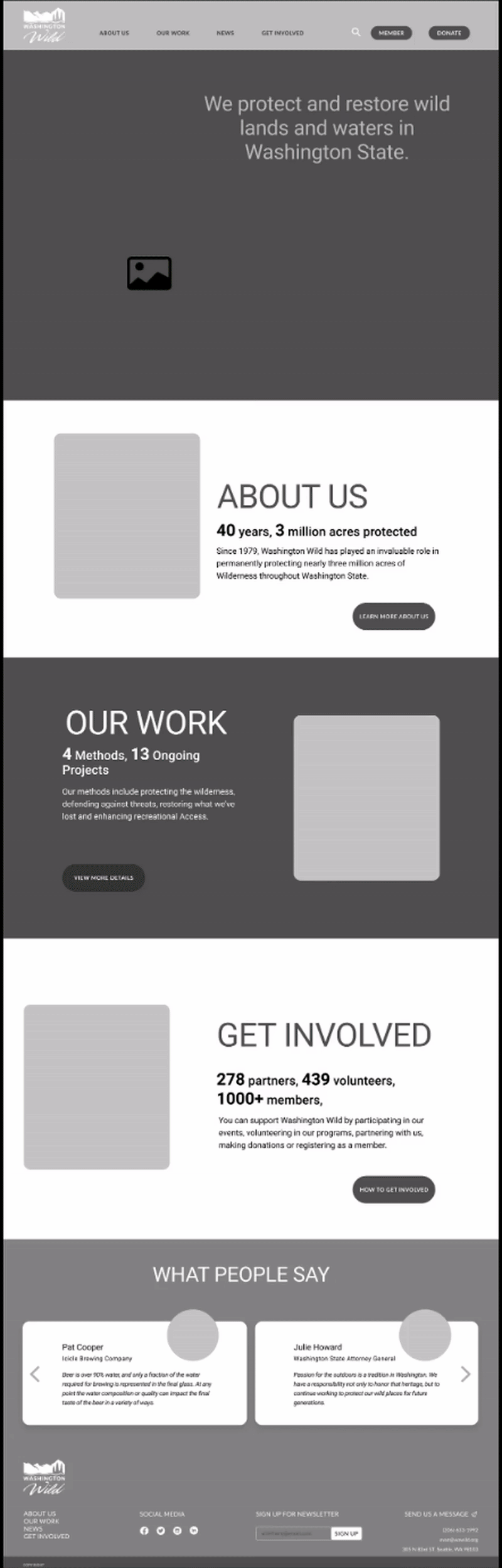
We worked on the pages that we were interested in individually. My focuses were Home page and About Us page.
However, working remotely made converting group ideas into one consistent design even more difficult than before. To overcome the constraints, we shared our sketches on Miro for design critiques and came up with design principles for our desirable outcome before we moved forward to digital drawings.
Taking business goals into consideration, the design should be...
01.
Informative
Effectively communicate who WA Wild is and what it does
02.
Welcoming & Effortless
Encourage community engagement and foster action-taking
03.
Preventative & Effective
Clearly guide all user groups on how to get involved and support WA Wild
04.
Distinguishable
Establish a distinguishable look and identity to differentiate from similar organizations
from mid-fi to hi-fi
challenge 03.
Balancing business goals and users goals when we received conflict feedback from users on specific design decisions
solution 03.
Ensured overall usability and provided alternative solutions to emphasize business values
what I did
From wireframes to low-fidelity prototype, I was responsible for building design system including grid system, spacing requirements, reusable components and icons. By implementing design system in early stage, we were able to keep our design consistent and delivered better results within limited time.
What I've changed from low-fi to mid-fi screens:
-
Consistent and universal design pattern which can be implemented to not only the pages I was responsible for but also other pages
-
Integrated call-to-action buttons to the content in a more intriguing way which can naturally encourage users to participate
-
Reorganized the content on text-dense page to make it more readable
-
Focused on display specific information in an attractive and interesting way
testing data analysis
To ensure the usability, we tested our mid-fidelity prototype with 6 participants, 2 for each user group remotely via Zoom. The insights and challenge came along together during the testing, as the needs of three user groups are different, we've got conflict feedback on some of the design. We had to make decisions on how to balance the business goals and user goals while some feedback apparently were more beneficial to the organization.
To ensure our team know what to focus during iterations, I created a table in Miro to further group the feedback into three categories:
-
Fixed by flow
-
Fixed by graphic
-
Fixed by wording/content

key iterations
Home & About Us
challenge 04.
The information architecture and multiple windows for signing up email list did not meet users' mind set as expected which caused confusions and difficulties of finding particular information
solution 04.
Revised information architecture regarding to users' feedback and changed multiple email list sign-up windows into single universal access under 'Contact' page

final design
ui design
challenge 05.
Proposed and persuaded client to accept an alternative color palette
solution 05.
A short video and a gif demonstrating why the new color palette can bring more benefits to the organization
At the beginning of the redesign, we've received a rebranding material from the client with color palette and typography. As the rebranding was done recently, client expected us to implement the materials directly into our design.
However, after we evaluated the materials, business goals and desirable outcome, we decided to propose an alternative color palette which can better assist client to achieve their goals. Besides, we implemented the type face from the materials as we wanted to respect client's rebranding works.
design system
As we worked individually, a design system with usable elements was essential to ensure the design consistency. I was responsible for building and updating the design system through out the whole project cycle.

interactive prototype
reflection
what I learned
As my first web design project, I encountered different challenges along the way including time/resources constraints, remote collaborations, and communication with client. I learned from these challenges and the experiences I had during the process will be valuable for me to become a more mature designer and team-player.
01.
Communicate with teammate when we have different opinions
During the final round of design, I had different opinions about the drop-down menu considering the usability. The original drop-down menu required users to hover twice before they found the link they wanted. As I noticed hovering on menu caused some usability issues during the testing, I suggested to reconsider the drop-down menu design by sharing my observations, research articles and some examples. By communicating my thoughts and respecting others' contribution, we changed the menu for better experience.
02.
Design with contraints
One important thing I learned was as a designer, I should be able to deliver optimized solutions within various constraints. Constraints are not obstacles to my design, they framed my design and helped me align the design to business goals. It is important to communicate with client and understand the 'why' behind the constraints.
03.
Communicate with stakeholders smartly
Communicated with stakeholders smartly by considering the project from their perspectives and translated design decisions into some compelling ways that are easier for them to understand.