
Octopus
a smart hub that automates first-time parent's baby care life with smartness and happiness
Project Type
Personal Side Project
Team
Feifei Deng, Wenjia Zhao, Song di
My role
Design System Lead, UX Research Lead, UX/UI Designer
Duration
Dec 2019 - Apr 2020
overview
problem space
01.
First-time parents are suffering various stress after baby
02.
96% of millennial parents use technology to help their parenting life. A generation of data-driven parenting is coming as a matter of time.
03.
Within smart baby care market,
the predicted growth of baby-monitoring submarket alone is from $929 millions in 2016 to $1.63 billions by 2025.
If the market of smart baby care products is growing rapidly,
why millennial parents are still struggling with their baby care life?
The problem is...
There is not enough smart products
There are too many options and they are isolated
How might we
design a product that can utilize the benefits of smart technologies to provide first-time parents clear guidance and bring their fragmented time back to a whole
A product that can integrate smart babycare devices and smart home system, generate pre-set routine/tasks for parents to follow and allow parents to know what have been done to avoid confusions and redundant works
solution
background story
start of the journey
We’ve heard many stories about how difficult it could be as first-time parents long before we had the idea of creating something to help the parents, even before entering the UX industry. Things had changed this year; as a group of new UX designers, these are no longer just some ‘scary stories’ from our friends, but a problem space worthy of exploring. My response to these baby care stories has changed from ‘I hear you’ to ‘why don’t I create something to tackle the problems?’.
This is where the journey started.


research
-
research procedure
-
the users
-
the market
research procedure

the users
Although we've heard lots of stories about struggled parenting life, we are never the real users - not even close, to be honest.
So how can we understand the users? What were they struggling with? What was the environment? Who was/wasn't involved? Did they seek for help? How did that go?...
These questions wouldn't have an answer unless we put our feet into users' shoes. The purpose of the research was to help us understand the 'WHY.'

key takeaways
01.
Time management and work-life balance
02.
Unequal Contributions of House Works
03.
Sleep Deprivation and Problematic Mental Health
04.
Mutual Understanding and Support
05.
Lack of Baby-Focus Smart Devices Integration
06.
Confusions and Nervousness about baby's growth
the market
'Smart parenting', 'Smart baby care', 'Smart home system' - none of these is new. In fact, the market is snowballing, and innovative technologies are emerging almost every day. Before we figure out why these products can not solve parents' problems, we need to understand what is out there, how they solve problems, and most importantly - what is missing.
Considering the massive amount of smart devices, we divided the market research into two sections: Individual Device/App and Smart Home System. I was responsible for the competitor analysis of the current smart home system. I mainly looked at the strengths, future trends, and compatibility of Amazon Alexa, Google Home, Apple Home kit, Wink Hub 2, and Samsung Smart-things.

design
-
opportunity
-
concept exploration
-
user journey
-
information architecture
-
feature walkthrough
opportunity
By triangulating user research results, smart home system, and baby care app analysis, we found the design opportunity - a combination of automation and baby focus. We decided to take advantage of the rapidly growing smart home technology and applied the existing knowledge of baby care to smart home devices to reduce parents' cognitive load.

design
concept exploration
This is a sorting process - we identified the users’ needs, went crazy with brainstorming, then narrowed it back to structural solutions.

why we used user journey map
challenge 01.
Individual persona couldn't fully represent users' pain points and wasn't helpful for us to understand the contextual scenarios.
solution 01.
Used a family journey map which demonstrated how the whole day baby care experience looked like.
During creating personas, I decided to use a family journey map rather than separated personas to illustrate the scenarios better and address the pain points that parents are facing. Based on the preliminary user research, I found that the users' needs were not linear, which would change depends on the baby's stages throughout the day. Moreover, first-time users' mutual support and collaboration needs forced me to consider the family as a whole. I discussed and identified the design opportunities with my teammates and narrowed down the project's scope to only tackle the most critical problems that users have.
The user journey map helped us put ourselves into users' shoes and reinforced the empathetic connection between the users and us. There were lots of potential difficulties that parents faced throughout the day. Thus, We identified the main pain points by focusing on the overlapped moment that both mom and dad had problems. As smart devices played an important part in the concept, we identified what devices were involved throughout the journey.


feature mapping
After we had a vague concept of the product and principles we wanted to follow, implementing them to the actual features was challenging.
It is important to align the features back to the problem space to make sure users’ needs are emphasized.

information architecture
We developed five main features of Octopus after ideations and a user journey map: Home, Routine Management, Device Management, Task Management, and Data Center. To establish Octopus's structure and decide how the features support each other, I created an overall information architecture diagram.

feature walkthrough
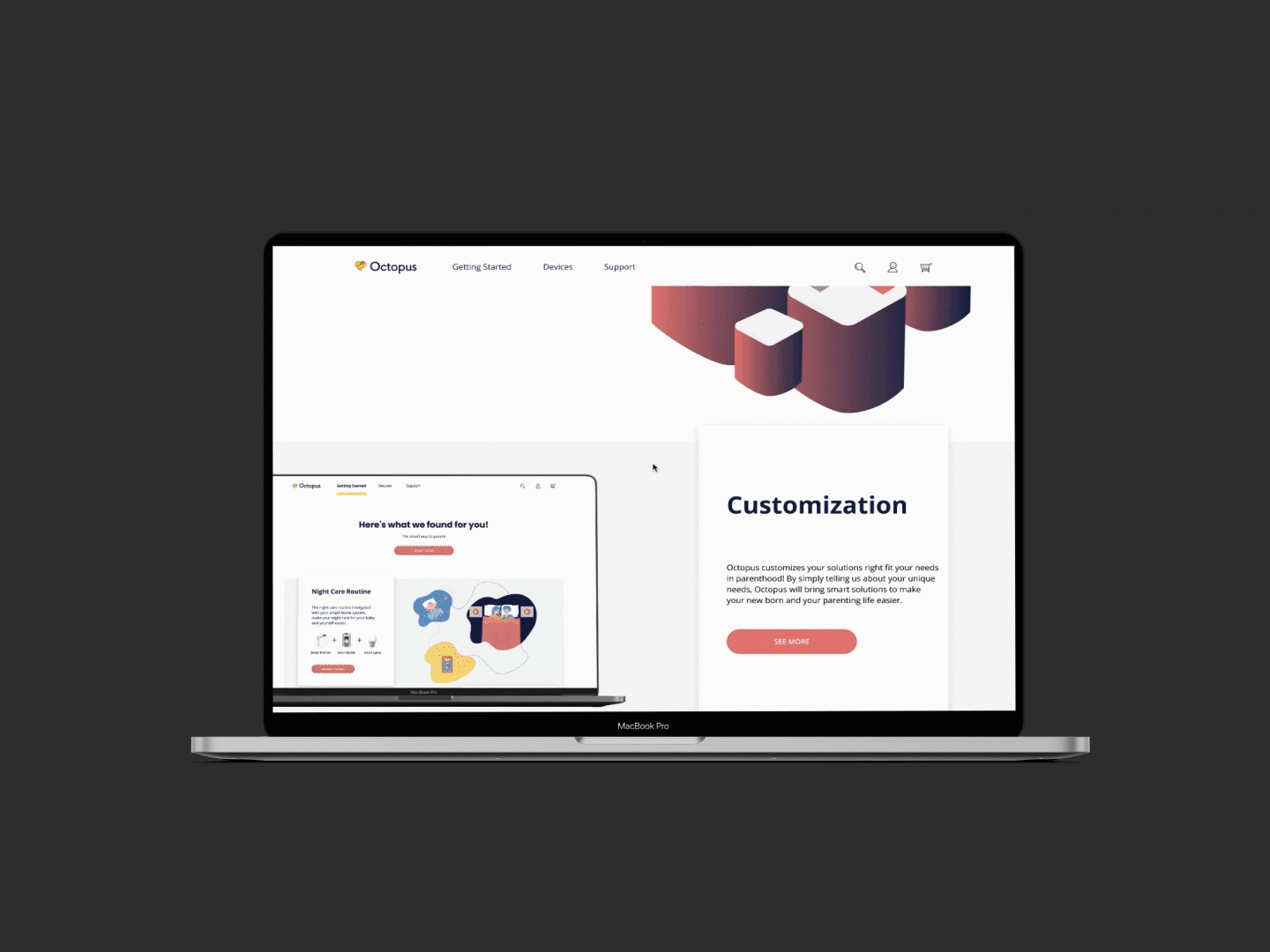
Octopus Web
Learn How it Works
Introduction and information about how Octopus can help you simplify the baby care life
Customized Package
Get customized devices list and find the right one to fit your needs
Targeted Problem
Confusions and nervousness about baby
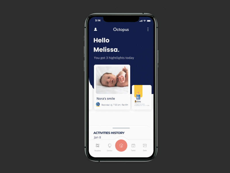
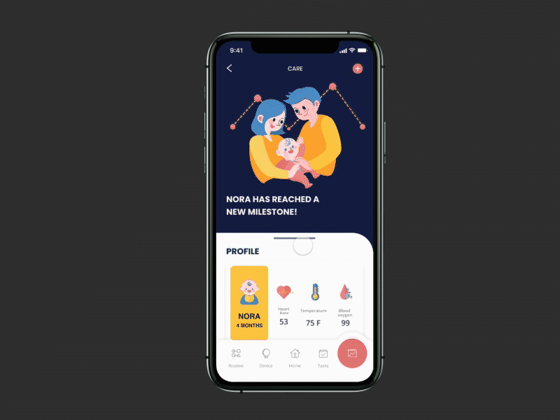
Home
Highlights
Never miss fun moments of your baby
Activities History
Better support your loved one by knowing each other's contributions
Targeted Problem
Mutual understanding and support;
Family planning fall more on the mother
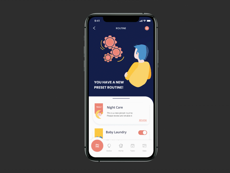
Routine
Pre-set Automation
Automate your baby care routine without confusions
Customized Setting
Trigger the automation in various way to fit your needs;
Adjust routine setting to fit the busy and changing schedule
Targeted Problem
Time management;
Sleep deprivation
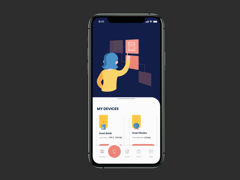
Device Management
Instant Control
Quick start when needed
Track Device Settings
Never lose the track of device history and manage your devices in one place
Targeted Problem
Time management;
Smart device integration
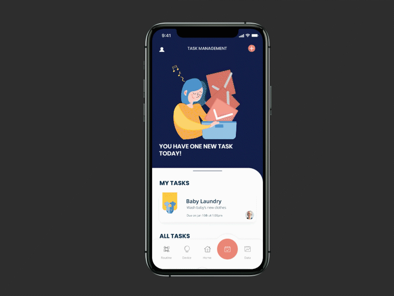
Task Management
Assign and Manage Task
Assign tasks to yourself or your family to contribute together
Integrate with Routine
Supportive routine will be added into task for convenient management
Targeted Problem
Time management;
Mutual Support;
Family planning fall more on the mother
Data Center
Visualized Baby Data
Summarize baby's growth pattern for you
Check Milestones
Always be aware of your baby's upcoming milestones
Targeted Problem
Confusions and nervousness about baby
iterations
-
usability testing summary
-
home page
-
task management
-
routine
from low-fi to mi-fi
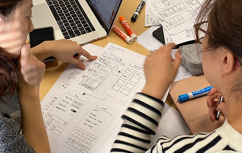
Equipped with information architecture, site map, and key user flows, we split the features considering both time constraints and workload; I was mainly responsible for the Home page and Task management. We worked individually on our assigned features and reviewed the design as a group once a week.
We conducted three rounds of usability testing with ten targeted users throughout the iteration process from the Low-fi to Mid-fi prototype. The testing had similar procedures while there were two slightly different emphases.
-
Exploratory Testing with Paper Prototype
-
Assessment Testing with Mid-fi Digital Prototype
I was responsible for the research plan, testing materials, moderating the testing, and a written testing report. The following table demonstrated what we did, how we did, and the actions we took after each testing.

key iterations
Home Page
challenge 02.
The activity history of devices didn't improve the trust but became distractions to the information users cared about.
solution 02.
Highlighted activities that related to the baby and parents while eliminated activity history of the devices to reduce distractions.
In the Homepage, my original consideration was to only include the highlighted information that users care about the most.
-
Special moments of the baby
-
To create delightful moment when users open the app
-
Solve users' concerns of missing baby's fun moments/milestones
-
-
Changes that users made
-
Help parents know their contributions
-
Keep parents in the same page
-
-
Activities history of users and devices
-
Show what had been done by the devices to build trust
-
Keep in track of parents' contributions
-
"What I really care is the PEOPLE, not the device."
However, users found the information about devices distracted during the first round of usability testing. My assumption of providing delightful details on the baby was right, but I ignored the most critical point - it's all about PEOPLE. Although it was nice to know devices were running well, users expressed all they cared about was people. They wanted to understand information that related to the baby and the family.

Task Management
challenge 03.
Users couldn't understand the 'Swipe to delete' gesture without hint while their intuition was to tap the task card
solution 03.
Allowed users to tap and flip the task card to check the task and kept 'swipe' gesture as accelerator for experienced users.
The purpose of task management was to help parents assign the housework easily, which addressed the 'unequal contribution' and 'mutual support' problems. Considering similar apps, I applied the conventional design for task management to avoid extra learning curves.
"My intuition is just tapping the card for checking (the task)... "
Although Task Management's interface was similar to all the other task-related apps, users couldn't finish the task as fluently as I expected. Here was where I found a small hint would save users' time and effort.

Routine
challenge 04.
We failed to provide 'just enough' options for the users, which caused the task flow of Routine challenging to complete.
solution 04.
Further considered the experience level of the parents and provided the simplest options for first-time parents.
For Task Management, Routine, and Device Management, we wanted to address all the problems we identified and provided enough flexibility to the users. We believed users' usages, experience level, and preferences of smart devices are various.
"I want (something) that can generate routine automatically and let me see how it works immediately... "
However, during the usability testing, the low success rate of Routine and Devices made us realize that increasing flexibilities trapped us in the same issue that other smart devices have - providing too many options. I suggested taking a step back to remind ourselves what differentiates first-time Parents from other smart device users.

final
-
final solution
-
ui elements
-
branding
final solution
challenge 05.
There was no one-size-fits-all solution as the needs of users and the familiarity with the baby and smart devices will change
solution 05.
Adaptive content and setting which took the changing experience and needs into consideration
Building upon the previous prototype and testing results, the primary strategy that we used is 'Learn as you go' - a progressive learning experience that can better fit into users' mental models. The fact that parents' needs will change as the baby grows up, it is essential for Octopus to be adaptive for long-term and sustainable usage. We wanted Octopus to grow with the users.
We also fixed the wordings, interactions, layouts, and information that caused usability deficiencies in this stage.

UI elements
design system
As UI design was an important part of the user experience, we discussed how the UI elements would support and enhance the product. The goal of the UI style was:
-
Create delightful trustful impression for users
-
Ensure design consistency and increase workflow efficiency
Thus, I created the whole design system from scratch with reusable design elements in Figma.

branding
We had a vision of how we wanted to brand Octopus if it became a real product. I designed the logo and named the product to reflect the project's core value - an assistant that can help first-time parents handle multiple tasks of baby care life.
reflection
what I learned
Here is the end of our journey with Octopus. My team had learned valuable lessons throughout the process. The struggles, challenges, and joyful moments helped us grow individually and as a team. I learned the power of teamwork, research, and iterative design - although the design process didn't go well all the time, we've been pushing ourselves to seek answers and solutions.
01.
Learn as you go
As the first IoT related project I've ever worked on, this project was challenging and educative at the same time. The unfamiliarity of technical knowledge forced me to learn actively and seek help throughout the process. As a designer, I will not know everything about technologies; thus, it is important for me to know how to fill the gap - approach to the available resources online; communicate with people who have the knowledge, etc.
02.
Always keep the main users' needs in mind
It is possible to get lost in new ideas and features during the design process. I believe it is useful to revisit the users' needs we identified initially, which can help me stay focused on the most valuable things for users and shape my design decisions. It's not difficult to provide more options to users, the challenging part is how to simplify it as I need to carefully consider which options should remain and which can be removed
03.
Observe how users use the product whenever have chance
I remember a moment during the usability testing: the baby started crying while mom was working on the testing; thus, she had to hold and calm the baby. This little accident I encountered during testing proved why observing users are important.
First, the observation brought me back to the feedback I received earlier, and I could clearly understand why the user had that thought.
Second, imagining the testing was unmoderated, I could probably notice the time that the users spent on this particular task were long, but I wouldn’t know whether it was because of the design or other reasons. Metrics are important but it can’t tell me everything, it taught me if I want to know whether the design works, I should carefully choose the metrics and considered any confounding factors that could impact the results.
There was another thing I could’ve considered more during the design process - which is our users suffered from situational impairments a lot, sometime the distraction would even make them hard to reach the phone.